
Boing Channel – Branding

abduzeedo
Nov 11, 2016
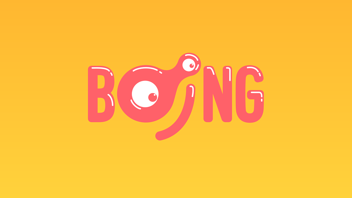
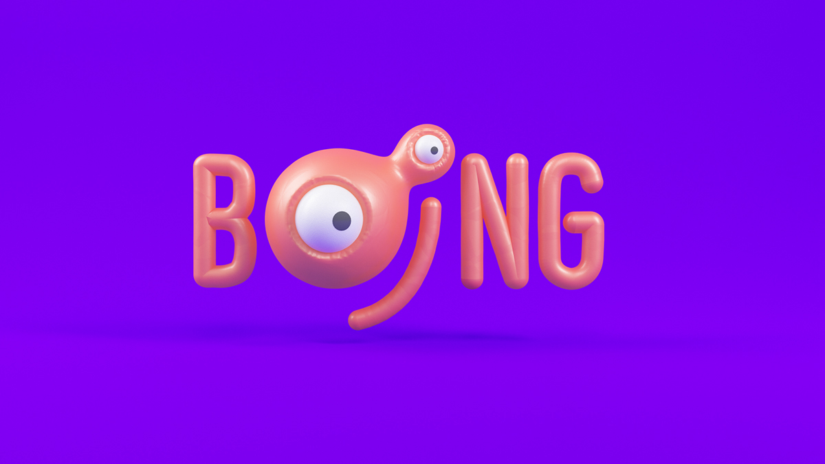
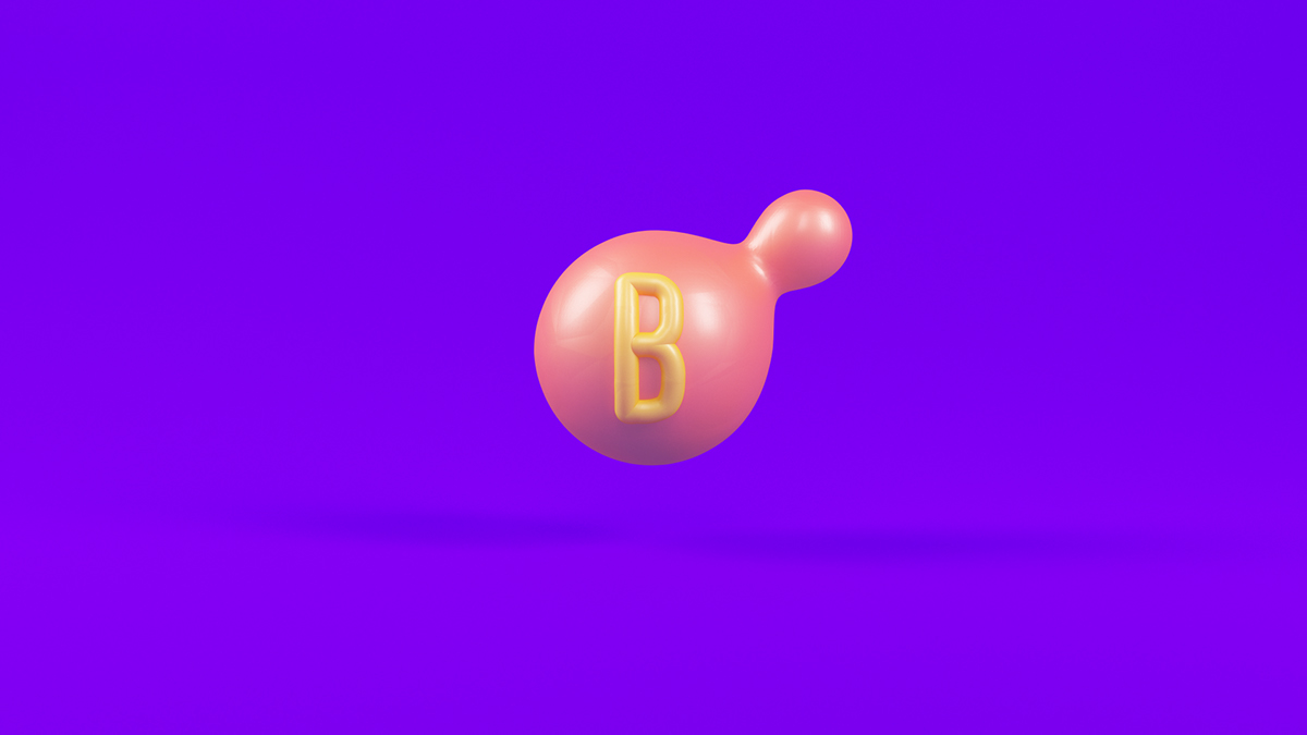
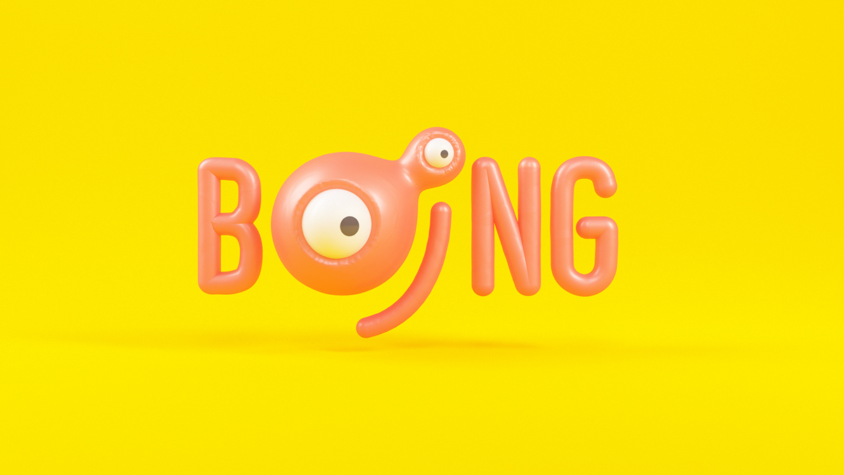
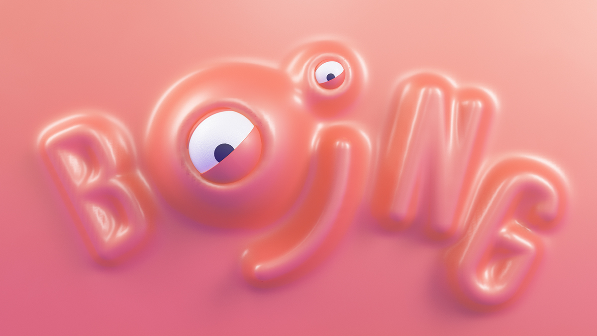
Boing is a branding and visual identity project created and shared by TAVO. The project is a new rebrand for a TV channel in Spain with the main goal of creating a brand that is identifiable in the diverse countries that it would be displayed. They kept the circular shape of the logo that has been used in the recent years and playing with the point of the letter “I”, used before. With that they could evolve the logo and typography while maintaining the original essence, giving a new personality with more possibilities to communicate.
We Pitched in the new rebrand of Boing Channel for Turner Spain. We Had to go through the different trajectory and problems of this brand in different countries, pros and cons. For the unification and renewal of Boing channels we believed that a complete rebrand of the Logo, characters and ident in general was necessary, to unify the whole brand.
Branding


Credits
- Concept & Art Direction: TAVO
- Producer Executive: BEETA
- Music & Sound Design: Aural Sound
- Client: TURNER

Source: Abduzeedo
Boing Channel – Branding