
Branding & Visual Identity: 7Cycle

AoiroStudio
Jan 24, 2017
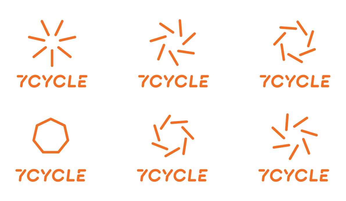
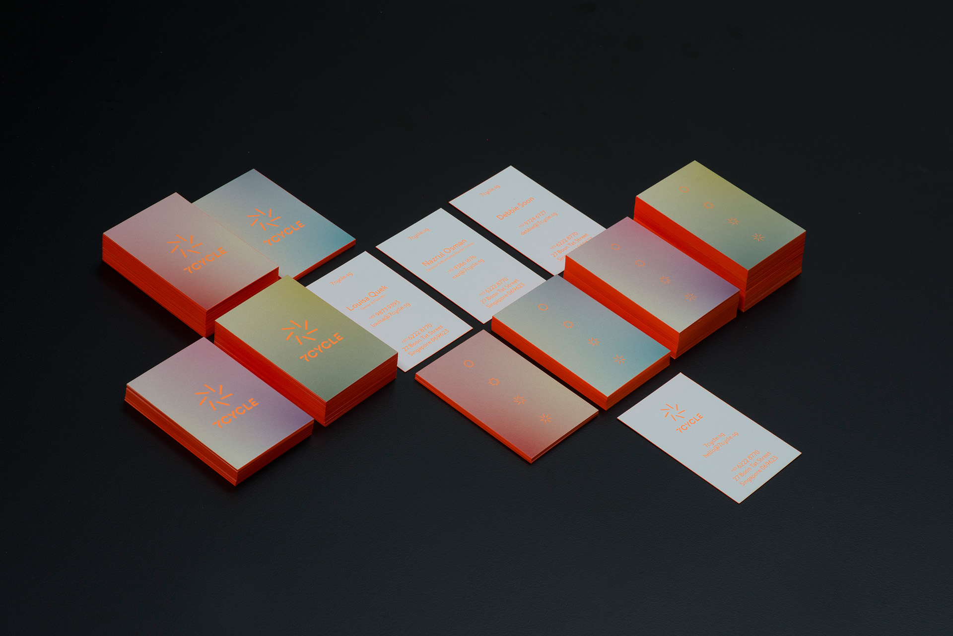
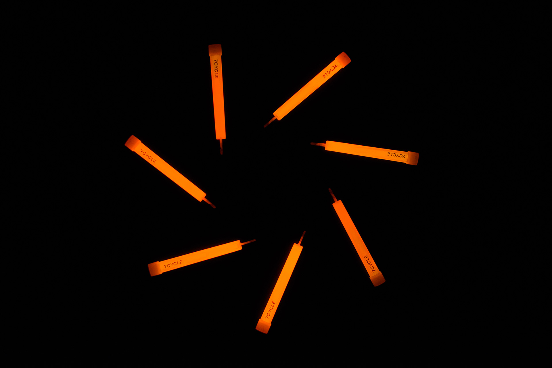
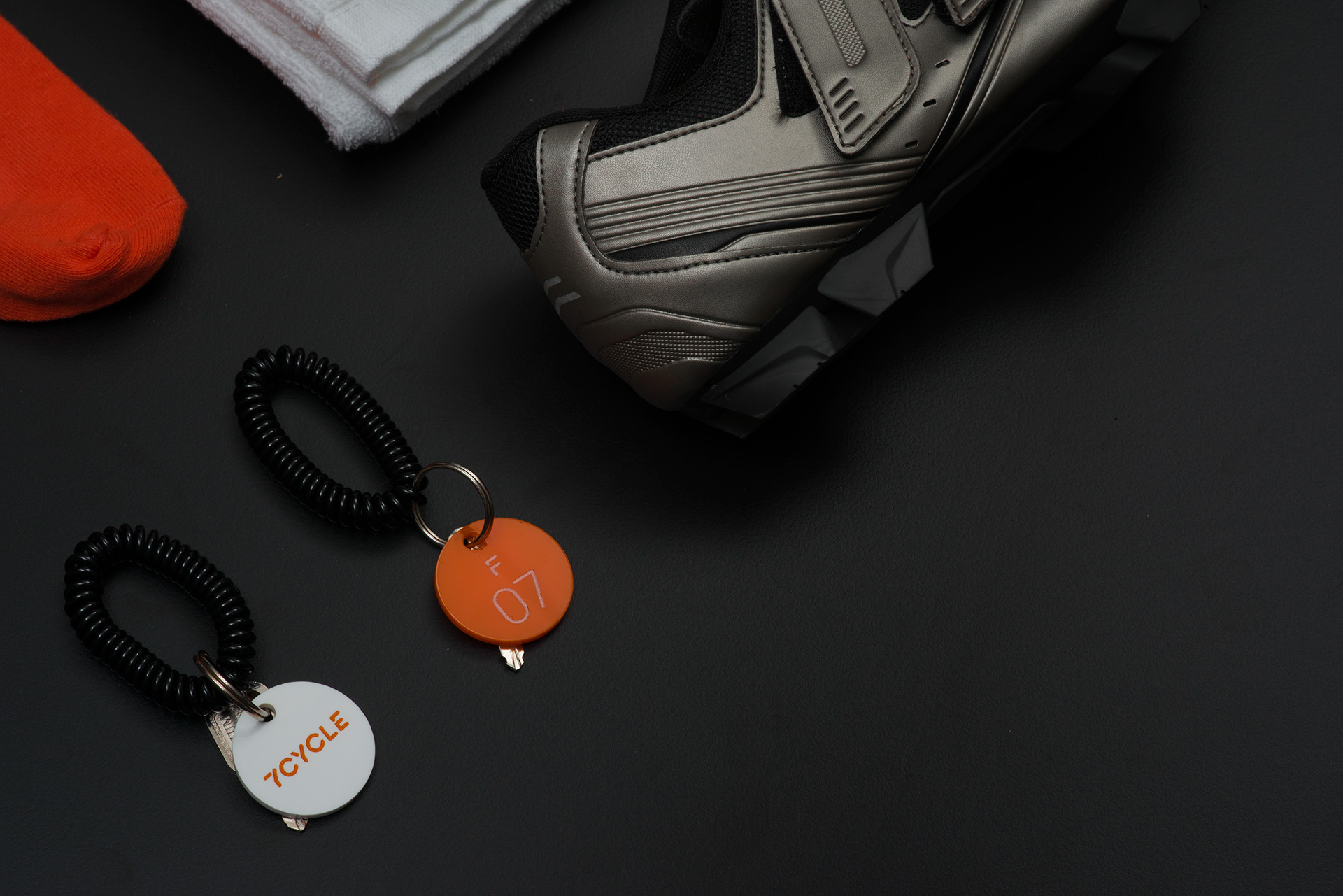
Let us share this branding & visual identity project for 7Cycle, a cycling studio that aims to make the best of a short workout of exercises and where it gets interesting; a rave-like atmosphere to switch it up. Behind the brand, the design has been done by ACRE, with the subtle gradient happening and hard to achieve on print. I would say the fact that the print can glow in the dark is quite a nice touch and very beautiful.
ACRE is a design house located in the heartlands of Singapore. They are focusing their work on branding, experience, interior design and product design.
Two different moods were expressed in the interiors – areas of intensity and calm. For the workout studio and stairwell, we lit the space with black light and neon elements to invoke a more intense atmosphere and experience. Peranakan motifs in neon was employed to create a pop-art aesthetic on the stairwell, juxtaposed with the same motifs employed on the windows albeit in white. In contrast, the ambience in the showers, juice bar and reception space is light. The intention of the gesture was to promote a calm atmosphere for community, conversation and relaxation after a rewarding day’s work in the gym.


Source: Abduzeedo
Branding & Visual Identity: 7Cycle